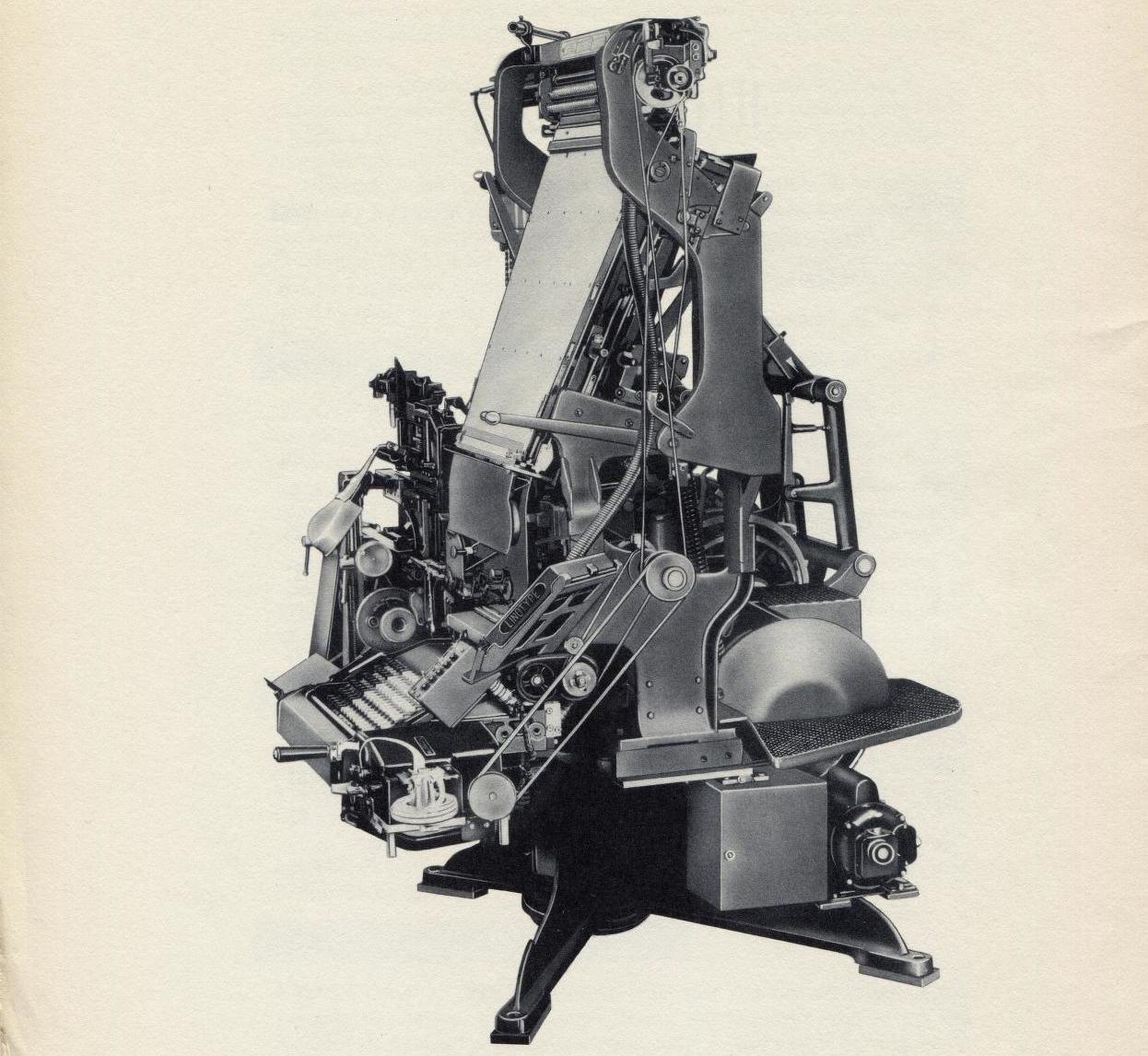
There’s a post over at Print Magazine about Frank Romano’s new book, History of the Linotype Company, which chronicles the rise and decline of the Linotype, a “glorious contraption” that was not so very long ago the industry standard for printing newspapers, magazines, catalogs, you name it. I’d be lying if I said I knew how it worked—to look at it is to imagine it taking your hand off—but fortunately there’s Wikipedia, which explains:
The linotype machine operator enters text on a ninety-character keyboard. The machine assembles matrices, which are molds for the letter forms, in a line. The assembled line is then cast as a single piece, called a slug, of type metal in a process known as “hot metal” typesetting. The matrices are then returned to the type magazine from which they came, to be reused later. This allows much faster typesetting and composition than original hand composition in which operators place down one pre-cast metal letter, punctuation mark or space at a time.
The machine was invented by Ottmar Mergenthaler, a German immigrant who set up shop in Brooklyn. At the height of its powers, the machine was used in eighty-six countries and in 850 languages. And the public domain is teeming with miscellany from the Mergenthaler Company, which produced an endless succession of handbooks, manuals, brochures, and pamphlets, among them Linotype’s Shining Lines, a sort of trade magazine with impeccably designed cover art:
The best publication I found is probably The Legibility of Type, a design fetishist’s vade mecum published by Mergenthaler in 1935; it opens with “Type Was Made to Read,” a kind of Lord’s Prayer for printers and typographers, as dictated by a foreman with an irritating tendency to speak in rhymed couplets:
Type Was Made to Read
“Type,” said the Foreman, “was made to read,
And that is a maxim it’s well to heed,
For the printer frequently gets a start
With a craze for ‘beauty,’ a bug for ‘art,’
Which holds him fast in a fearful gripe
And keeps him trying mad stunts with type,
With seventeen fonts and seventy styles
And borders by thousands and rules by miles.“Type,” said the Foreman, “was made to read,
But the printer, oftentimes, in his greed
For novel features and ‘class’ and ‘tone,’
Forgets this fact he has always known
And sends out work that is fine to see
And ‘smart’ and ‘natty’ as it can be,
A job with a swagger and high-bred look,
But hard to read as a Chinese book!“Type,” said the Foreman, “was made to read,
And that should serve as the printer’s creed,
For work on the Linotype machine
Or hand-set jobs should be clear and clean,
Not ornamental, obscure, bizarre,
Composed of all of the fonts there are,
But simple, legible, quiet, plain,
A joy alike to the eye and brain!“For art in printing is not the way
Of wild extravagance, weird display,
But rather the unobtrusive thrall
Of type that gives you no shock at all,
But draws your eyes to the page with zest
And holds your mind to the thought expressed;
We must keep ourselves to this simple creed,
Type was made—and is meant—to READ!”
The same pamphlet offers “Typographic Sanity,” a bombastic plea for order in the increasingly chaotic world of typesetting. It’s impressively solemn, for a piece of writing about fonts:
As the cold gray dawn breaks upon the morning after an orgy of tangled type design, a weary printing industry shakes its aching head and asks, “Whither are we bound?”
The descent was easy; from black to blacker, from fanciful to grotesque, from freaky to freakier, but when we have plumbed the depths, when the tastes of printer, of reader, are all thoroughly debauched, when we have achieved the ultimate in blackness, in illegibility, in riotous disorder—then to seek the return to the brighter regions of calm and ordered sanity; to reaccustom our ink-sated and jazz-jaded senses to a normal scale of values—this is labor, and this is the path that still lies ahead of the users of type.
The wave of reaction against the excesses of the last few years has been inevitable. Throughout the whole mad era, the Linotype organization has pleaded for moderation; for the guiding hand of good taste and good sense in the laudable quest for freshness of expression. In the face of insistent demands from many of its customers for surrender to the vagaries of the moment, it has striven to maintain its policy of typographic sincerity and to issue only typefaces of lasting worth. It would be a simple matter for the Company to design and cut matrices that would sell.
It took far more vision to refuse to issue worthless types merely for profit, and instead to present only those faces which are fundamentally sound in design and character and which will be a credit to the publisher who uses them.
The policy is not new with Linotype. It goes back to the very beginning of the Company’s typographic activity. This principle has been stated, restated and reiterated. It seems sound and sensible now, because it was sound and sensible when it was announced, and common sense doesn’t change with passing years.
“Ink-sated and jazz-jaded”—this is the work of a copywriter who clearly dabbles in poetry.
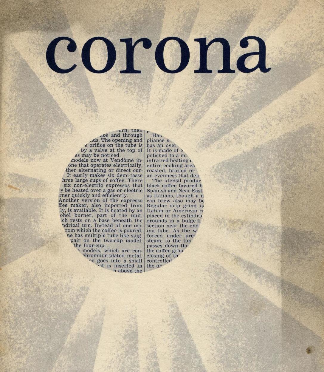
If you’re looking to kill a few more hours, I can also recommend a 1951 brochure advertising Corona, a Linotype-designed typeface “tested to provide top-level performance in newspapers and catalogs”:
For sport, you can try various lines from it at cocktail parties—see how far “Probably at no other period in newspaper history has there been a need for printing news at such materially stepped-up speeds as were required during the recent hectic war years” gets you.


